
// the output
An economy, not a stock.
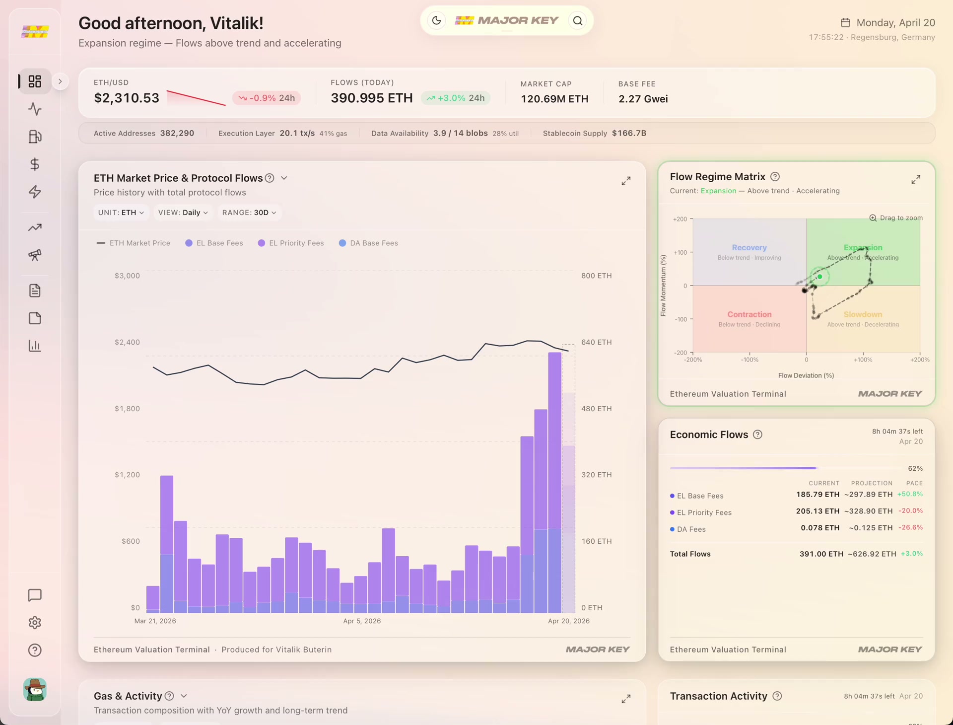
Every swap, every transfer, every rollup batch pays a fee to use the network. That fee flow is Ethereum's real economic output — the thing your ETH gives you a per-token claim on, measurable by the block.
The methodology
The first ETH valuation model built entirely from the network's own economy — no borrowed stock-market math. Every step explained, and the out-of-sample proof that it works.
Lucas Dünnes & Dr. Jens Felsenstein-Eckberg · MAJOR KEY Research · Accenture · Under review at Management Science
// the idea
Every model people reach for borrows its yardstick from somewhere else — a stock to discount, a bond to yield, a bar of digital gold to hoard. Each one forces Ethereum to behave like something it isn't, then blames the asset when the numbers don't fit.
But Ethereum is none of those things. It's an economy. It has its own output — the fees paid by everyone who uses it — and, unlike any company, it has its own currency to price that output in. Measure it on its own terms and the circular logic that breaks every borrowed model simply disappears.
// the output
Every swap, every transfer, every rollup batch pays a fee to use the network. That fee flow is Ethereum's real economic output — the thing your ETH gives you a per-token claim on, measurable by the block.

// the unit
You'd never judge a country by converting its GDP into a foreign currency first — the exchange rate would swamp the signal. Price Ethereum's fees in dollars and you just re-measure the price. Price them in ETH, and the economy comes into view.
An economy with its own output, priced in its own currency. That's the entire reframe — and the part every borrowed model quietly skips. Which leaves the harder question: how do you turn it into a number?
// the method
The whole framework is three moves. No earnings to forecast, no borrowed analogy to defend — just the network's own activity, read in its own units, turned into a price you can hold up against the market.
01
Measure the demand
How hard is the network actually being used?
02
Compare it to normal
Is that above or below its own baseline?
03
Read the price it implies
What value does that demand justify?
Three numbers, recomputed every day from nothing but on-chain activity — no analyst estimates, no sentiment, no inputs the market can argue with. The next three sections take them one at a time: what each one measures, how it's calculated, and exactly what it looks like live in the terminal.
Walk through the model01
FI = Fees ÷ Supply
Think of it like GDP per capita. A country's total economic output divided by its population tells you how productive each person is. Flow Intensity does the same thing — total fees divided by total ETH supply tells you how much demand each unit of ETH generates.
Every day, the Ethereum network collects fees from two sources: execution fees (smart contracts, DeFi, transfers) and data availability fees (Layer-2 rollup settlement). We add them together and divide by the total circulating ETH supply.
The result is a single number that captures the network's economic output per token. It rises when demand increases and falls when activity slows. No dollar prices involved.
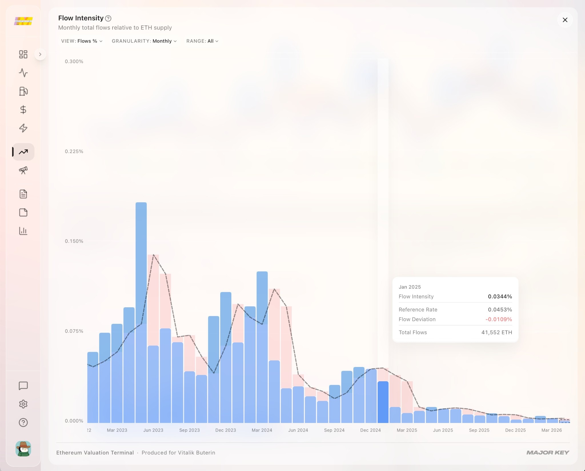
One number. The economy's output per unit of currency.
02
FD = ln( smoothed FI ÷ Reference Rate )
Is the economy running hot, or is it in a downturn? If a country normally produces $50K GDP per capita and today it's producing $60K, the economy is running above trend. Flow Deviation measures exactly this — how far current demand sits above or below its historical baseline.
First, we smooth the daily Flow Intensity with a 30-day average to filter out noise. Then we compare it to the Reference Rate — the 90-day trailing median of FI, which represents “normal” activity.
We use the median instead of the average because fee distributions are heavily skewed — a single congestion event or gas war would distort a mean. The median gives us a stable, trustworthy baseline.
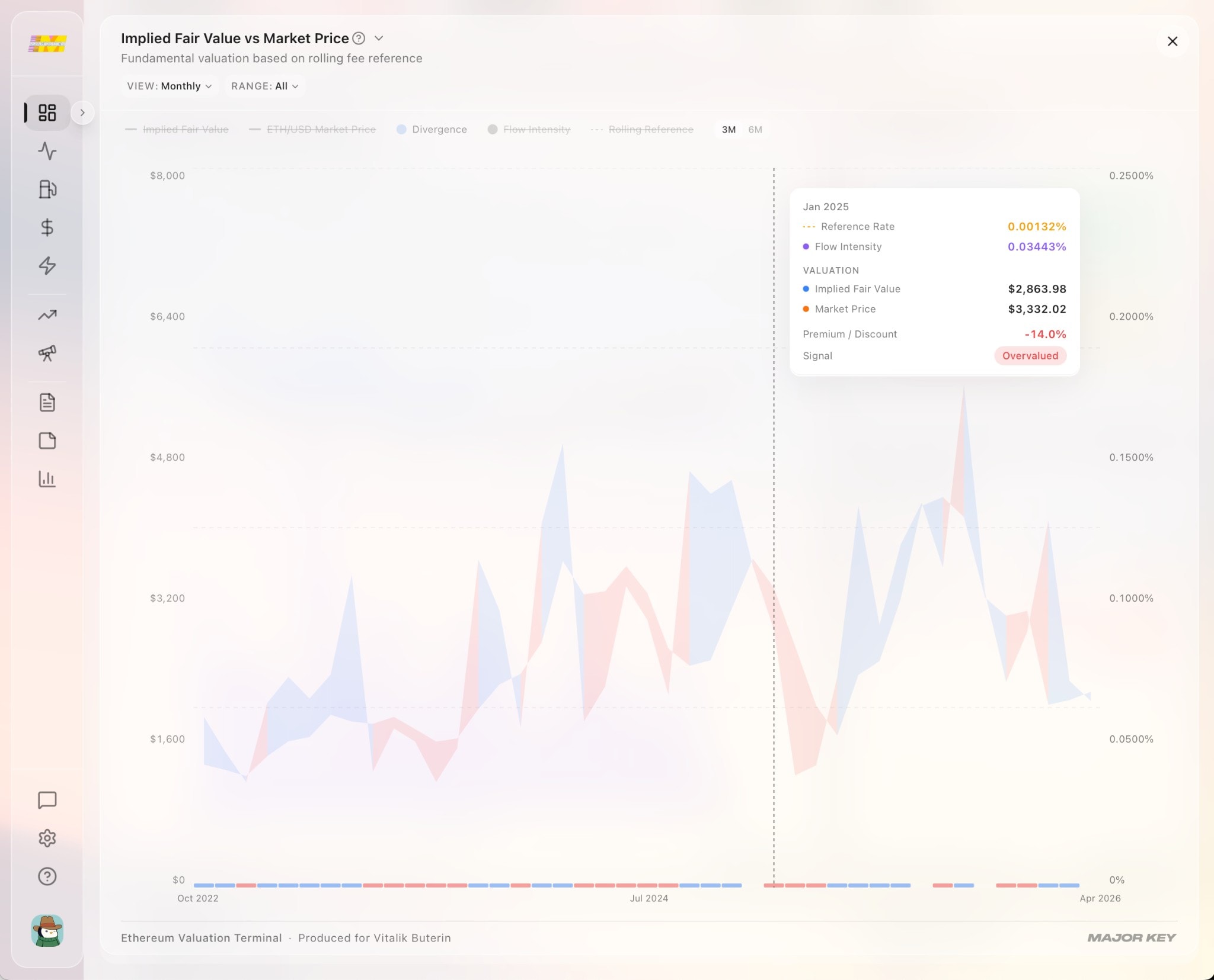
FD > 0
Above trend
Demand exceeds baseline. Market may be underpricing ETH.
FD = 0
On trend
Current demand matches the historical norm.
FD < 0
Below trend
Demand is below baseline. Market may be overpricing ETH.
Above trend means the network is earning more than the market reflects.
03
Fair Value = Price × exp( FD )
If the economy is running 20% above normal, the currency should be worth 20% more than the market currently says. That's the implied fair value — today's market price, adjusted by how hard the economy is actually working.
The formula takes today's ETH price and scales it by the Flow Deviation. When demand runs above trend, fair value sits above the spot price. When demand runs below trend, fair value sits below it.
No growth-rate assumptions. No discount-rate calibrations. No opinions about where crypto markets are headed. The only inputs are the protocol's own fee history and its own token supply.
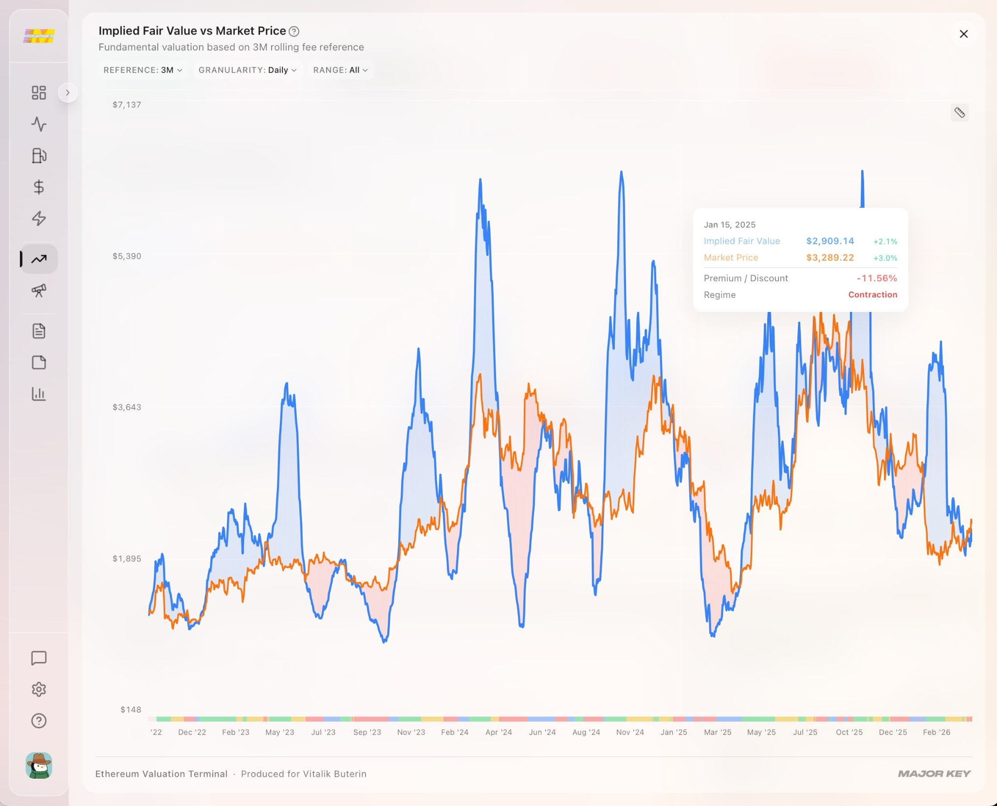
No growth assumptions. No discount rates.
Just the protocol's own economic growth.
See it in action
// why now
For two years, every fee on Ethereum competed in one market — the cost of running computation and the cost of posting data, blended into a single number. Two different kinds of demand, impossible to tell apart. No model could find the signal, because it was buried under the noise of the other.
Then, in March 2024, the Dencun upgrade gave data its own dedicated market. You can see the exact moment it happened.
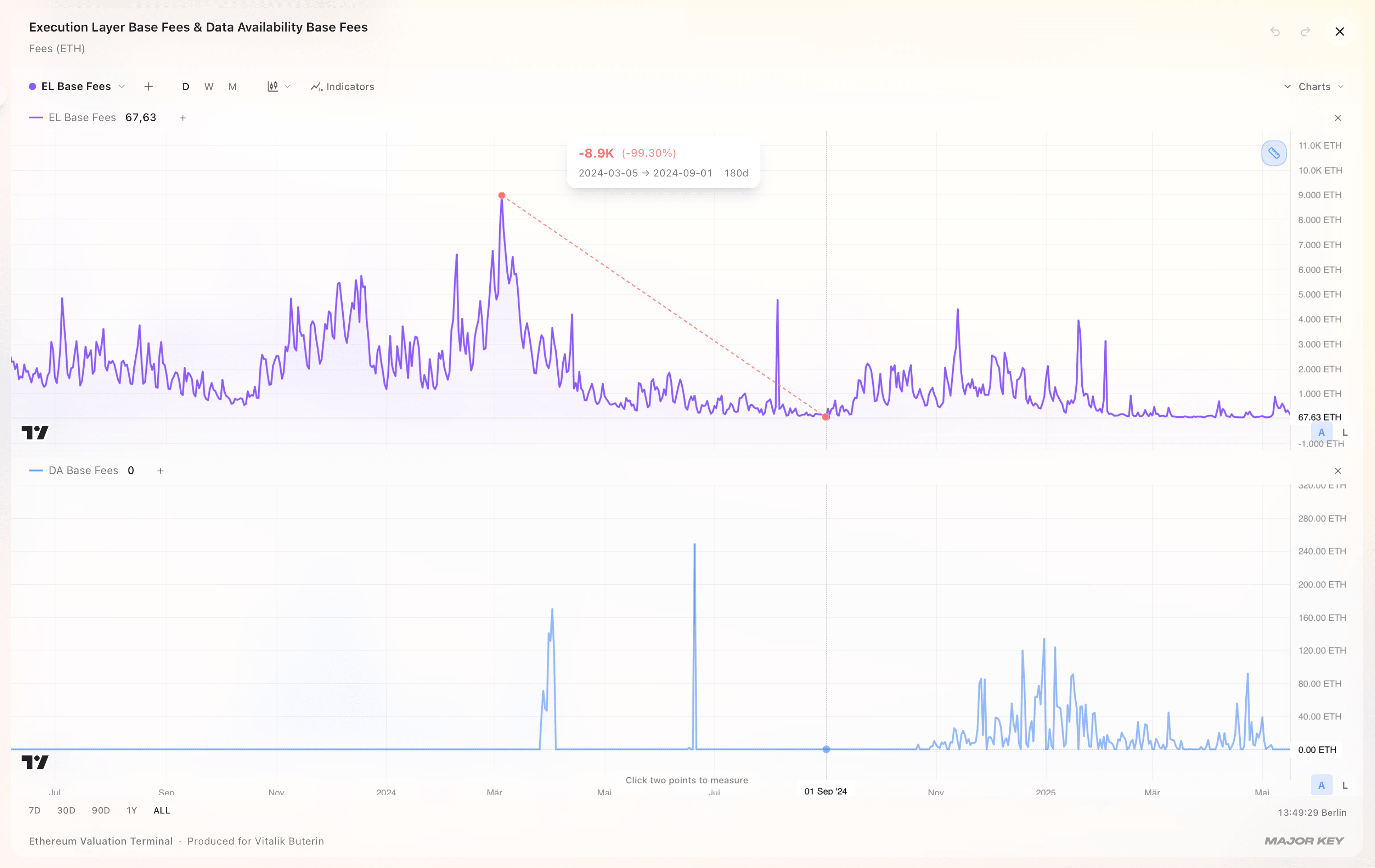
March 13, 2024 · EIP-4844
Before
Computation and data competed in one fee market — two radio stations broadcasting on a single frequency. All you could hear was static.
After
Each demand got its own channel. Execution fees became a pure measure of how hard Ethereum is being used — and the signal finally came through.
One upgrade pulled two signals apart.
What's left is a clean read on real demand.
See the results
The proof
We didn't just build a model and declare it works. We held data back, ran the model forward, and measured what happened.
22.8%
Peak explanatory power
Explains roughly 1 in 5 dollars of price movement
76.4%
Direction accuracy
Called the direction right 3 out of 4 times
3.5 yrs
Of daily data
Every day from The Merge to present
Working paper · MAJOR KEY Research · Accenture · Under review at Management Science
In-sample predictability (post-Dencun, N = 645)
| Horizon | Coefficient | t-stat | p-value | R² |
|---|---|---|---|---|
| 10 days | 0.080 | 2.65 | 0.008 | 5.1% |
| 20 days | 0.171 | 3.22 | 0.001 | 10.0% |
| 30 days | 0.282 | 3.87 | <0.001 | 15.8% |
| 45 days | 0.456 | 3.84 | <0.001 | 22.8% |
| 60 days | 0.459 | 2.94 | 0.003 | 17.1% |
Expanding-window out-of-sample
| Horizon | OOS R² | Clark-West t | Dir. accuracy |
|---|---|---|---|
| 30 days | 9.0% | 7.73 | 67.1% |
| 45 days | 14.4% | 9.16 | 76.4% |
| 60 days | 10.3% | 9.63 | 73.1% |
A naive “always long” benchmark achieves 35.5% directional accuracy at 45 days. The model's 76.4% is a 41 percentage point improvement.
Day-to-day, price moves first and fees react — consistent with rising prices attracting more users. Week-to-week, price corrects toward the fee-implied equilibrium with a half-life of roughly 7 weeks. Both dynamics are real, operating at different frequencies.
Updated daily
Robustness
Nine independent tests. Every way we could think to challenge the signal. It survived all of them.
Questions
Common questions about how the model works, what it measures, and how it was validated. If there are any questions not answered here, please reach out.
Paper reference
“Demand-side fee flows and return predictability on Ethereum”
Lucas Dünnes & Dr. Jens Felsenstein-Eckberg
MAJOR KEY Research · Accenture
